Heavy Metal Album Cover Art
I remember being a kid, probably around ten or eleven, and my older cousin snagged this record. He was way cooler than me, obviously, and he had this whole aura of mystery about him. He'd blast this music that sounded like a dragon trying to eat a garbage disposal, and I'd peek into his room, a little terrified but utterly captivated. The cover of that album… man, it was like a portal. All these swirling colors, some kind of demonic-looking creature with way too many eyes, and this band name that looked like it was written in blood. I swear, I spent more time staring at that cover than listening to the actual music at that age.
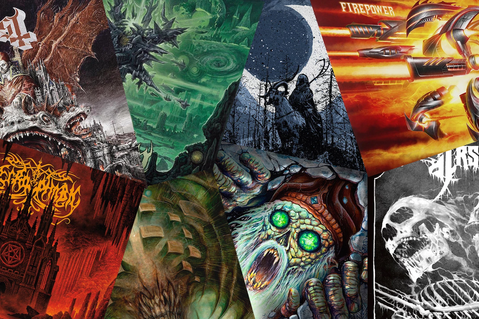
And that, my friends, is where the magic of heavy metal album cover art truly begins. It’s not just a picture; it’s a whole damn statement. It’s the handshake before the mosh pit, the prologue to the sonic onslaught. You pick up a record, or even just see a thumbnail online, and that artwork immediately tells you… something. It might be "run for your life," or "prepare for epic battle," or even just "we're probably going to be a bit weird."
Think about it. When you’re diving into the world of heavy metal, you’re not usually looking for gentle acoustic ballads about sunsets and happy puppies, right? (Though, hey, some metal bands do surprise you with that kind of stuff. More on that later, perhaps.) You’re looking for something that shakes you up, something that makes you feel… more. And the artwork is the first siren song, the first hint of the chaos, the majesty, the sheer audacity that’s about to hit your eardrums.
More Than Just a Pretty (or Ugly) Picture
It’s so easy to dismiss album art as just… stuff. Like, oh yeah, that’s the cover for that band. But in the realm of heavy metal, it’s practically a sacred text. It’s the visual manifestation of the music’s soul. The colors, the imagery, the typography – it all works together to create a complete experience. It’s the packaging for pure, unadulterated sonic rebellion.
And the artists who create this stuff? They’re legends in their own right. We’re talking about people like Derek Riggs, whose iconic zombie mascot "Eddie" for Iron Maiden is probably one of the most recognizable figures in music history. Or H.R. Giger, the mastermind behind the Alien creature, who lent his surreal, biomechanical nightmares to some of the most unsettling and brilliant album covers ever. Imagine trying to capture the essence of a band like Celtic Frost or Danzig without that distinctive, dark, and often disturbing visual flair. It just wouldn’t feel the same, would it?
I mean, seriously, have you ever seen the cover for Slayer's 'Reign in Blood'? It’s a bloody severed head on a spike. No ambiguity there. It screams "We are Slayer, and we are here to melt your face off." And it’s perfect. It sets the tone, it primes you for what’s coming, and it becomes inextricably linked with the music itself. You can't listen to 'Raining Blood' without picturing that gory masterpiece.
Then you have bands that go for something more… epic. Think about the sprawling, fantastical landscapes of some progressive metal bands, or the ancient, mythical imagery found on many black metal album covers. These aren't just random drawings; they're carefully crafted worlds designed to transport you to another dimension, a place where dragons roam and gods wage war. It’s escapism, but with a healthy dose of darkness and intensity.

The Darker, The Better?
Okay, let's be honest. A huge part of heavy metal’s appeal, visually speaking, lies in its willingness to go to the dark side. We’re talking demons, skulls, gore, occult symbols, zombies, eldritch horrors – you name it. And there’s a reason for that. It’s about pushing boundaries, about exploring the uncomfortable, the forbidden, the things that make us squirm a little. It's a way to confront our fears, to embrace the primal, and to find a strange kind of beauty in the grotesque.
Sometimes, I think the more outrageous and shocking the cover, the more it demands your attention. It’s like a dare. Can you handle this? Can you handle the music that goes with it? And for many of us metalheads, the answer is a resounding "hell yes!". It's a badge of honor, a sign that you're not afraid to delve into the darker corners of human experience.
And it’s not always about outright horror. Sometimes it’s about a certain mood. Think of the atmospheric, often bleak, imagery of doom metal. It evokes a sense of crushing despair, of slow, inevitable decay. Or the raw, untamed fury captured in the artwork of many thrash metal bands. It’s visceral, it’s aggressive, and it perfectly complements the relentless speed and power of the music.
It's funny, though. You'll see these incredibly detailed, often technically brilliant pieces of art, and then the music itself might be… well, let's just say it can be an acquired taste. But that’s the beauty of it, right? It’s a whole package. The art draws you in, and then the music either keeps you there or sends you running for the hills. And you know what? Even if it sends you running, you’ll probably still remember that cover.
The Evolution of the Macabre
Of course, heavy metal album art hasn't always been this way. In the early days, it was more rooted in the aesthetics of blues-rock and psychedelic rock. Think of Black Sabbath's self-titled debut, with its eerie, almost Lynchian forest scene. It was unsettling, yes, but not overtly gory or demonic.

As the genre evolved, so did its visual language. The rise of thrash metal in the 80s brought with it a wave of aggressive, often politically charged imagery. Think of Megadeth’s 'Peace Sells... but Who's Buying?' with its iconic depiction of a world in chaos, or Testament’s 'The Legacy' with its grim, skull-laden imagery.
Then came the death metal and black metal scenes, which really took things to a whole new level of extremity. Artwork became more graphic, more disturbing, and more unapologetically offensive. It was a deliberate attempt to shock and provoke, to push the boundaries of what was acceptable. And it worked. These covers became synonymous with the extreme sounds that lay beneath.
But it's not all about shock value. Many bands also employ intricate, highly detailed artwork that tells stories, explores complex themes, or simply showcases incredible artistic talent. The progressive metal scene, for example, often features art that is as intricate and layered as the music itself, with sprawling fantasy worlds and thought-provoking allegories.
And let's not forget the power of a well-placed logo. Some band logos are as iconic as their album covers. The jagged, almost illegible script of Mayhem, or the swirling, menacing letters of Emperor. These logos are instantly recognizable, and they contribute just as much to the overall visual identity of the band as any artwork.

The Digital Age and the Vinyl Revival
It’s interesting to think about how the digital age has affected album art. With streaming services and digital downloads, you often only see a small thumbnail. Does that diminish the impact? In some ways, yes. You lose that tactile experience of holding a record in your hands, of really studying the artwork, of noticing the subtle details that might be lost in a tiny digital image.
But then you have the vinyl revival. People are rediscovering the joy of physical media, of holding that large-format artwork in their hands. And for many metal fans, that’s how it should be. They want to own the full experience, the art and the music together, in a way that feels substantial and meaningful.
It’s also led to some amazing reissues with expanded artwork, new liner notes, and even alternative cover art. It’s a way to celebrate the legacy of these albums and to give fans new ways to connect with the music they love. And let's be honest, seeing that classic artwork in its full glory on a vinyl gatefold is just… chef’s kiss.
Even with digital art, there's still a conscious effort to create striking visuals. You'll see bands commissioning artists specifically for their unique style, knowing that the cover art will be a major part of their identity. It’s not just an afterthought anymore; it’s an integral part of the creative process.
Why Does it Matter So Much?
So, why does this matter so much to us metalheads? Why do we get so passionate about the artwork on our albums? I think it comes down to a few things.

Firstly, it’s about identification. That cover is a visual representation of who we are, what we believe in, and what we’re into. It’s a way to signal our allegiance to a particular subgenre, a certain ethos, or just a shared love for something loud and powerful.
Secondly, it’s about curiosity and discovery. A striking album cover can be the gateway to a new band, a new sound, a new obsession. You might not know anything about a band, but if their cover art catches your eye, you’re more likely to give them a listen. It’s the visual equivalent of a killer riff – it draws you in.
Thirdly, and perhaps most importantly, it’s about artistry and storytelling. Heavy metal often tackles big themes – death, war, mythology, philosophy, rebellion. The artwork is a crucial part of telling those stories, of creating a world for the listener to get lost in. It’s a way to enhance the emotional impact of the music, to add another layer of depth and meaning.
And honestly? Sometimes it’s just about the sheer coolness factor. There’s something inherently awesome about a meticulously crafted, often bizarre, and always impactful piece of artwork adorning the cover of a blistering metal album. It’s a collector’s item, a piece of art for your wall, and a constant reminder of the incredible power and creativity that the heavy metal scene has to offer.
So, the next time you’re browsing for new music, or even just flipping through your old record collection, take a moment to really look at the album art. Especially in the world of metal, that cover is telling you a story. And it’s usually a pretty wild one. What’s your favorite metal album cover, by the way? I’m genuinely curious!