
Metallic Gold Color Hex Code
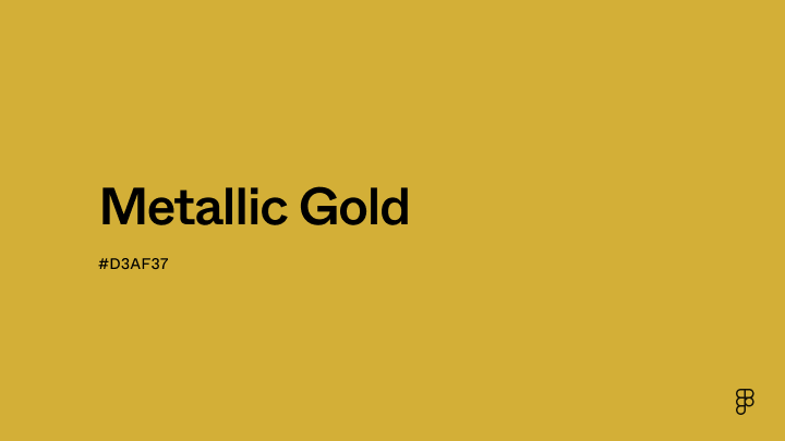
You know, I’ve always been a bit of a magpie when it comes to shiny things. My grandma used to joke that if it glittered, it was probably already halfway to my bedroom. And then, there was that one unforgettable birthday. I was probably about seven, and I got this enormous box wrapped in… well, it was gold. Not just any gold, mind you, but this deep, rich, metallic gold. It felt like unwrapping solid sunshine. The toy inside was cool, sure, but honestly, it was the wrapping paper that stole the show. I’m pretty sure I spent more time admiring the way the light caught its surface than playing with the actual gift.
That memory popped into my head the other day when I was fiddling around with some website design. You know, trying to make things look just a little bit more… opulent. And I found myself staring at the color picker, trying to find that perfect shade of metallic gold. It got me thinking: what is metallic gold, really? And how do we even tell computers to make it?
So, let’s dive into the glamorous, slightly nerdy world of the metallic gold color hex code. Because trust me, it’s more than just a number; it’s a whole vibe.
The Quest for Golden Hues
You see, when we talk about colors online, we usually rely on something called a hexadecimal color code, or hex code for short. It's like a secret handshake between you and your screen, telling it exactly which shade to display. These codes are a three-byte sequence, meaning they’re made up of six characters, preceded by a hash symbol (#).
Each pair of characters represents the intensity of red, green, and blue light, respectively. So, for example, pure red would be #FF0000. The higher the number (or letter – remember, hex goes up to F!), the more intense the color. Pretty straightforward, right? But here’s where it gets interesting: what about colors that aren't quite so… flat?
Think about actual gold. It's not just yellow. It has this incredible depth, a subtle sheen, a way of reflecting light that makes it look… well, rich. So, how do you capture that in a flat, digital format? It’s a bit like trying to bottle moonlight, isn't it?
The Illusion of Shine
Here’s a secret: there isn't one single hex code for "metallic gold." That’s the first thing that might blow your mind. Because metal isn't a pure color; it's a surface property. It’s all about how light interacts with it.
When designers want to create a "metallic gold" effect on a screen, they're actually trying to simulate that interaction. They’re using clever combinations of colors, gradients, and sometimes even textures to trick your eyes into seeing depth and shine. It’s a bit of digital alchemy, really.

So, what hex codes do designers typically gravitate towards when they’re aiming for that golden glow? Let’s explore some popular contenders.
"Actual" Gold (or close to it!)
If you’re looking for a hex code that resembles the color of real gold, you're often going to be in the range of yellows with a good dose of orange and perhaps a touch of brown. Think about the richness of molten gold.
One of the most commonly cited hex codes for a rich, deep gold is #FFD700. This is actually the hex code for the HTML color named “Gold”. And it’s a great starting point! It’s bright, it’s yellow, but it has a warmth that hints at something more substantial than a simple yellow. It’s like the color of a treasured coin.
Another popular choice for a slightly more muted, antique-gold look might be something like #DAA520. This is the hex code for the HTML color “Goldenrod”. See how it’s a bit deeper, a bit earthier? It’s like the gold found in ancient artifacts, not the blinding shine of a new piece of jewelry.
And then you have variations that lean more towards a bronze or coppery gold, like #B8860B (DarkGoldenrod) or even #C5B358. These codes start to introduce more brown and earthy tones, giving you a more sophisticated, less flashy kind of gold.
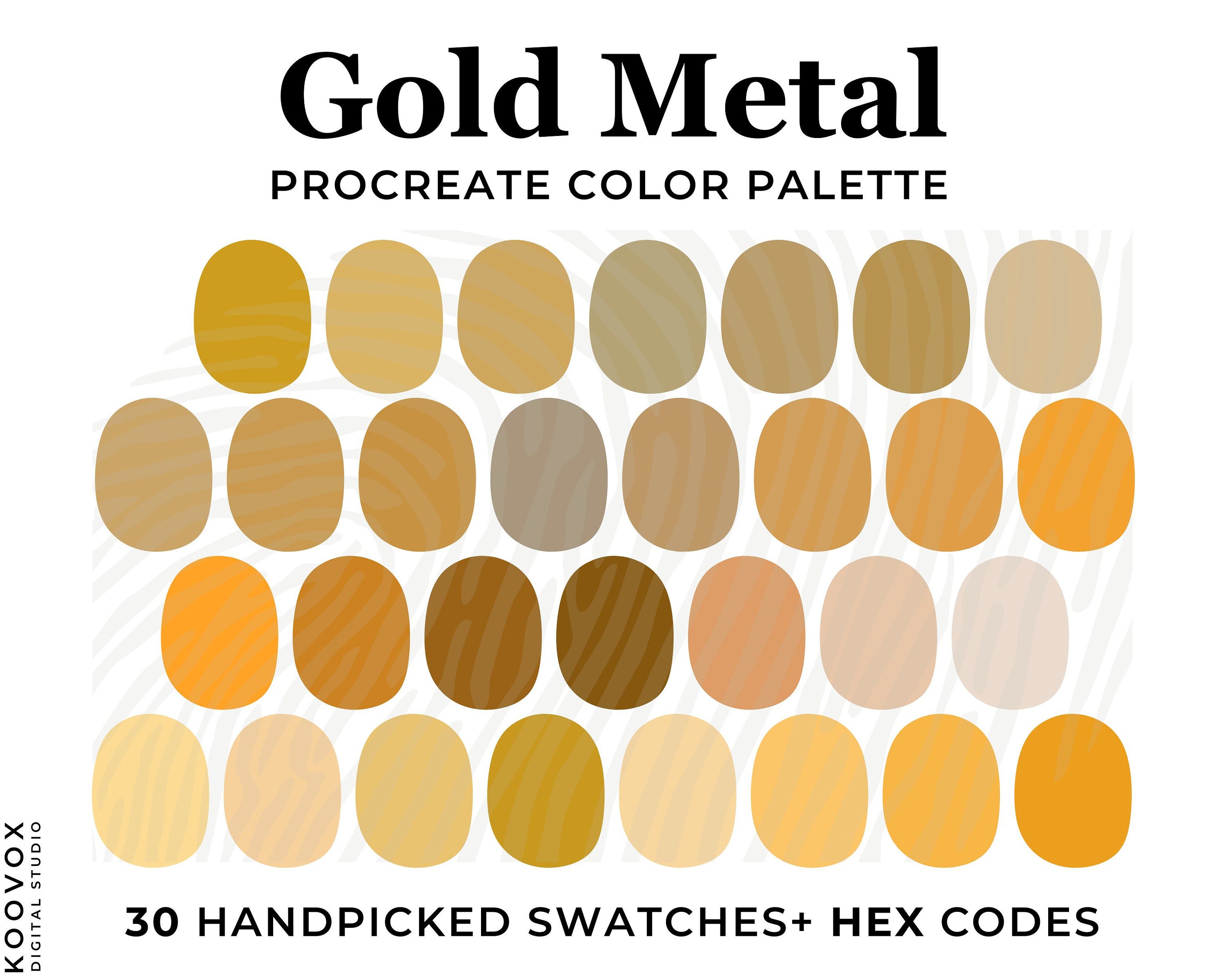
The thing is, even these hex codes, when displayed on a flat screen, don't inherently look metallic. They just look like a specific shade of yellow-brown. The magic happens in how they're used.
Making the Magic Happen: Gradients and Shadows
This is where the real art of digital metallic gold comes in. To make a color look metallic, designers use techniques that mimic how light reflects and casts shadows on a three-dimensional object.
One of the most powerful tools in their arsenal is the gradient. Instead of a solid block of color, a gradient transitions smoothly between two or more colors. For metallic gold, you might see a gradient that goes from a lighter, brighter yellow (the highlight) to a darker, richer gold, and then perhaps a subtle hint of a shadow color.
Imagine a perfectly polished gold bar. The light hits the top and reflects brightly, while the sides and bottom are in shadow. A gradient can replicate this effect. You might use a combination of hex codes within a gradient, perhaps starting with something like #FFFACD (LemonChiffon) for the bright highlight, transitioning through #FFD700 (Gold), and ending with a darker shade like #B8860B (DarkGoldenrod) or even a very deep brown.
Another trick is using subtle shadows and highlights. Even a simple button with a "metallic gold" background might have a slight inner shadow to give it a bit of depth, or a subtle outer glow to suggest it's catching the light. These aren't part of the main hex code for the color itself, but they're crucial for selling the illusion.

Think of it this way: the hex code gives you the base color, the raw material. But it's the skillful application of light and shadow, through gradients and other effects, that transforms that raw material into something that looks like precious metal. It's like having a lump of clay (the hex code) and then a sculptor’s tools (gradients, shadows) to turn it into a golden statue. Pretty neat, huh?
When is "Metallic Gold" Too Much?
Now, as much as I love shiny things (remember the seven-year-old me?), there’s a fine line between elegant opulence and… well, something that looks like it belongs on a gaudy 1980s Las Vegas casino floor. No shade to Vegas, of course! It has its own… charm.
The key to using metallic gold effectively is restraint and context. Is it a highlight on a logo? A button that needs to stand out? Or is it a background for an entire page?
If you go too bright, too saturated, or use it too extensively, it can become visually jarring. It can feel cheap or overwhelming. The best metallic gold effects feel deliberate, adding a touch of luxury without screaming for attention.
Sometimes, a subtle, almost matte gold can be far more effective than a blindingly shiny one. This is where you might play with hex codes that are a bit more muted, like #A08A4D or #9D8A3E. These still evoke gold, but with a more sophisticated, understated elegance. They’re the quiet confidence of gold, rather than the showy display.

Beyond the Screen: The Real World of Metallic Gold
It’s funny, thinking about hex codes and digital representations makes me appreciate the physical world even more. The way real gold catches the light is something truly unique. It has a warmth, a density, and a reflective quality that’s incredibly hard to replicate perfectly on a screen.
When you hold a piece of actual gold jewelry, you can feel its weight, its texture. You can see the subtle variations in its surface, the way it catches the ambient light, the soft glow it emits. These are all sensory experiences that a simple hex code can’t fully capture.
But that’s the beauty of digital design, isn’t it? It’s about creating an illusion. It’s about using the tools we have to evoke a feeling, a sense of luxury, a touch of grandeur. And when done well, that illusion can be incredibly powerful.
So, the next time you see a website or an app that uses metallic gold, take a moment to appreciate the effort. It’s likely not just a simple hex code being slapped on. It’s a carefully crafted combination of color, light, and shadow, all working together to bring a little bit of that magpie-worthy shine to your digital world.
And who knows, maybe it’ll inspire you to add a touch of digital gold to your own projects. Just remember, a little bit of shimmer goes a long way. Unless, of course, you’re aiming for that full-on, seven-year-old me, birthday-wrapping-paper aesthetic. In that case, go wild! 😉