Stress Strain Graph Of Mild Steel

Hey there, ever wondered what happens when you tug, pull, or bend something made of metal? Like, really really pull it? Well, buckle up, because we're about to dive into something super cool that engineers and material scientists geek out over: the stress-strain graph of mild steel. Don't let the fancy name scare you off; it's actually a pretty neat way to understand how a material behaves under pressure. Think of it like a secret handshake between a material and the forces acting on it!
So, what exactly are we talking about here? Imagine you have a simple metal rod, like one you might find in a building or a car part. You're going to apply a force to it, stretching it out. As you stretch it, you’re measuring two things: how much force you’re applying (that’s the stress) and how much the rod stretches (that’s the strain). Plotting these two measurements against each other gives you this magical graph.
Why is this graph so special, you ask? Because it tells a whole story! It’s like reading a comic book where the steel itself is the superhero, and the stress and strain are its epic battles. It shows us how strong the steel is, how much it can bend before it breaks, and even if it can bounce back to its original shape. Pretty handy, right?
The Journey of Mild Steel: From Straight to Stretched
Let's walk through the different stages you'd see on this graph for mild steel. Mild steel is super common, used in everything from paperclips to bridges, so understanding its story is a big deal.
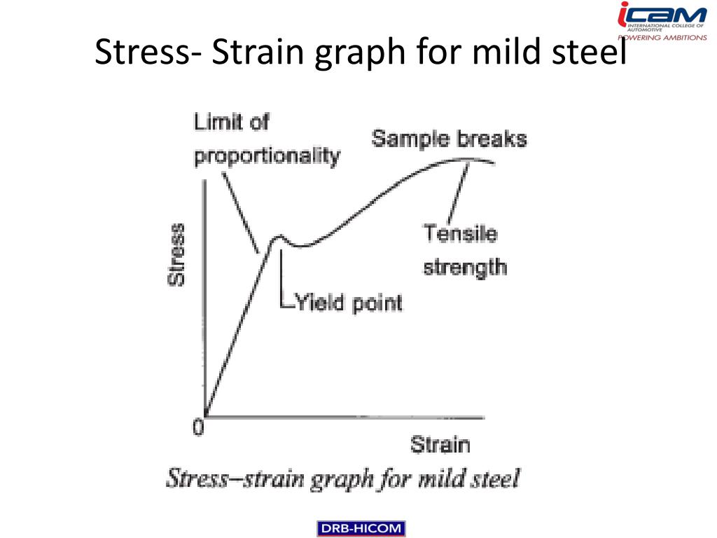
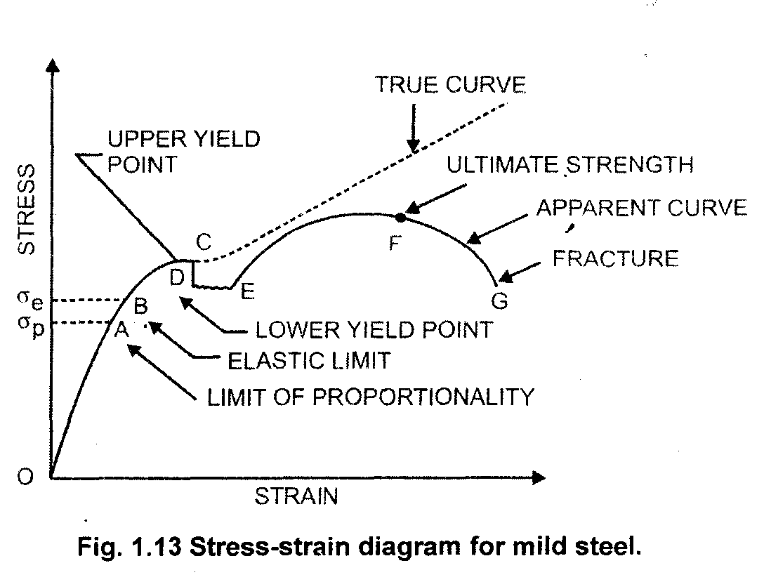
First up, we have the elastic region. Imagine you’re stretching a rubber band. You pull it, and it gets longer. But here’s the cool part: when you let go, it snaps back to its original size. That’s what happens in this initial phase. The steel is deforming, sure, but it's doing it elastically. This means that if you remove the pulling force, the steel will go right back to being its original, unstretched self. It’s like it never happened!
This part of the graph is usually a nice, straight line. This straightness is super important because it follows a fundamental law called Hooke's Law. Basically, it says that the stress is directly proportional to the strain. Double the force, double the stretch – as long as you stay in this elastic zone. Easy peasy!
The Point of No Return: Yielding
But what happens if you keep on pulling? You can't stretch a rubber band forever, and neither can steel. Eventually, you reach a point where things start to get a little more… permanent. This is where we hit the yield point.
Think of the yield point like the moment you bend a metal spoon just a little too much. It stays bent, right? That's because you've gone past the elastic limit. In the graph, this is where the straight line starts to curve. It means the steel is now permanently deforming. It’s not going to bounce back anymore, even if you stop pulling.
For mild steel, there’s often a very distinct yield point. It’s like the material says, "Okay, I've had enough of bouncing back. Now, we're doing this permanently." This is a really crucial characteristic of mild steel. It’s predictable, which is fantastic for engineers. They know that once they’re in this yielding zone, the steel will deform significantly without a huge increase in stress. This is called plastic deformation. It’s like molding clay – once you shape it, it stays that way.

This plastic deformation is what allows us to shape metals, like bending a piece of rebar for construction. Without it, metals would just snap! So, this "yielding" isn't necessarily a bad thing; it's a sign that the material is becoming more ductile.
The Ultimate Test: Tensile Strength and Breaking
Now, let’s imagine you’re still pulling, even after yielding. The steel is getting longer and thinner, like a piece of taffy being stretched. On the graph, you’ll see the stress continue to rise, but the strain increases much faster. The material is getting stronger as it’s being pulled, which might seem counterintuitive, but it’s a real phenomenon called strain hardening.
This is where the steel really shows its mettle. It’s resisting the pull, becoming tougher even as it deforms. It’s like a runner hitting their stride – they’re getting tired, but they’re also getting stronger and more efficient in their movement.
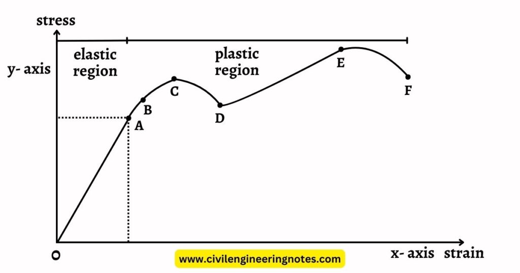
Eventually, you reach the peak of this curve. This is the ultimate tensile strength. This is the absolute maximum stress the steel can withstand before it starts to weaken. It’s the highest point on our stress-strain adventure.
After reaching this peak, the steel begins to "neck down." This means it starts to thin out significantly in one particular spot. The load-carrying capacity of the material actually decreases at this point, even though you’re still applying more strain. It's like a rope that's about to break – it can only take so much before one tiny spot gives way.
And then… fracture. The steel breaks. The graph suddenly drops to zero strain, signifying the end of the experiment. The steel, our hero, has finally succumbed to the immense forces applied.
Why is This Whole Graph Thing So Darn Cool?
So, we’ve seen the elastic stretch, the permanent bend, the hardening, and the final break. Why is this so interesting? Well, for starters, it tells engineers and designers exactly what to expect from mild steel. They can look at this graph and know:
- How much load can it take before it permanently bends? (The yield strength)
- How much can it stretch before it breaks? (The ductility, related to the total strain)
- What's the maximum force it can endure? (The ultimate tensile strength)
This information is absolutely vital for building safe and reliable structures. If you’re designing a bridge, you don’t want it to yield or break under normal traffic loads, do you? So, engineers use the data from these stress-strain graphs to make sure they’re using the right materials for the job.
Plus, it’s a beautiful illustration of material behavior. It’s not just abstract numbers; it’s a visual narrative of how a common material responds to being pushed to its limits. It shows resilience, adaptability, and ultimately, its breaking point. It’s a little bit like understanding a person – you see how they handle pressure, when they might bend, and when they might break.
Next time you see a steel beam, a car chassis, or even a simple nail, remember the incredible story it could tell if it could just draw its own stress-strain graph. It’s a testament to the power of materials science and the fascinating world of engineering. Pretty neat stuff, wouldn't you agree?